12+ Streaming PlatformGrowing Viewing Hoursby 195%
Keshet 12 replaced its legacy streaming product. I led the cross-platform UX behind 12+, from architecture to a shipped design system.
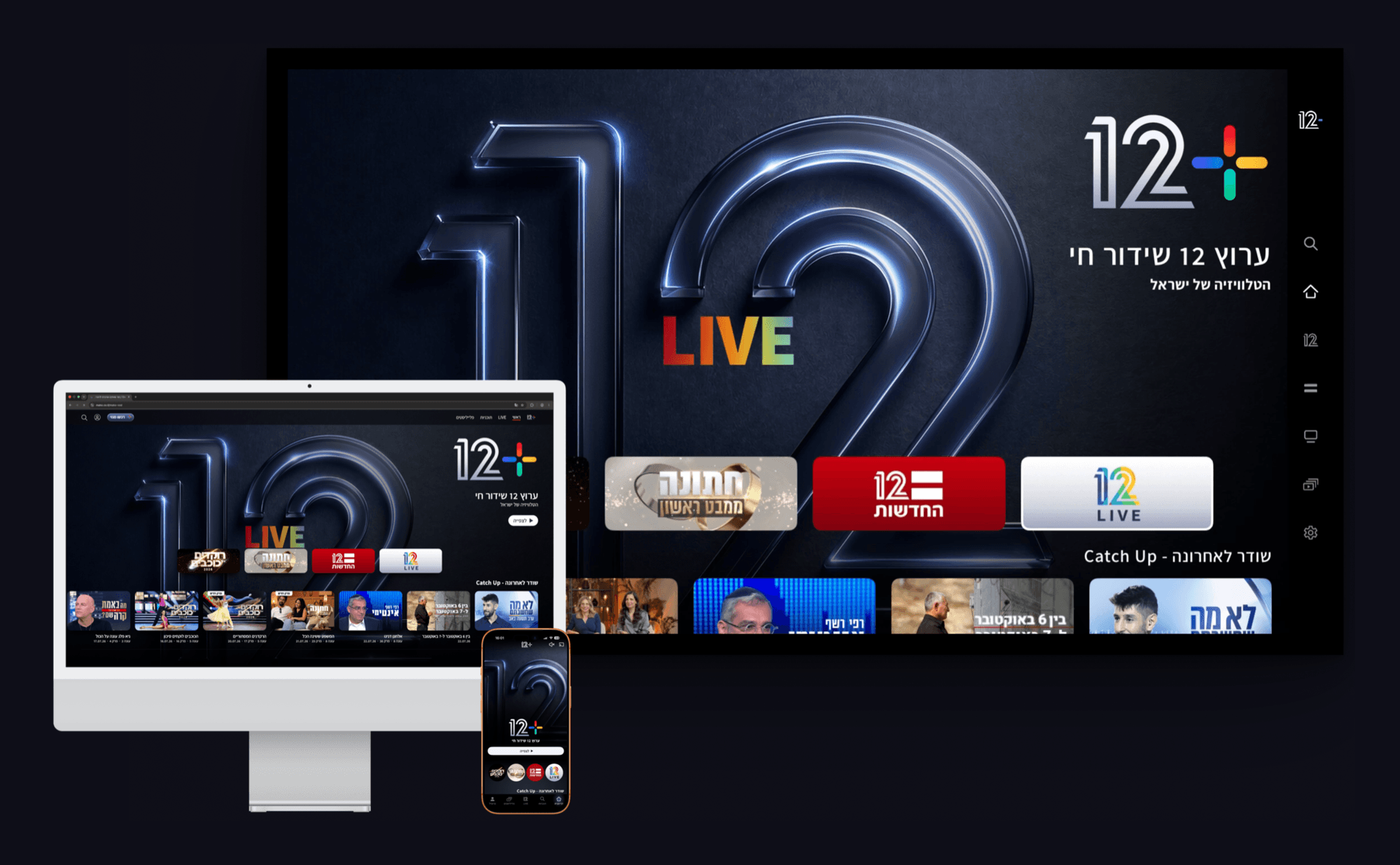
As Senior UX Designer, Cross-Platform Lead, I worked with two other designers, a PM and the dev team on 12+, the free, ad-funded streaming flagship of Keshet 12, replacing the legacy makoTV product. I led behavioural research into how Israelis actually watch, reviewed prior art from Disney+, Netflix, Hulu, Max and Apple TV+, mapped the full information architecture, sketched every screen by hand, then built the button and card system in Figma. I ran usability testing across web, mobile, tablet and TV.
Designing 1 Product for 8 Platforms
A Habit Had to Become a Destination
makoTV was a habit. 12+ had to be the destination. The brief was not a redesign. It was a flagship carrying live Channel 12, catch-up, a full VOD library, news, an EPG and curated video playlists, shipping on more than 8 platforms in Hebrew, right to left, with no paywall.
The product 12+ replaced. makoTV laid every title out in one flat grid at one size, with no live entry point and no hierarchy between a news clip and a cooking show.
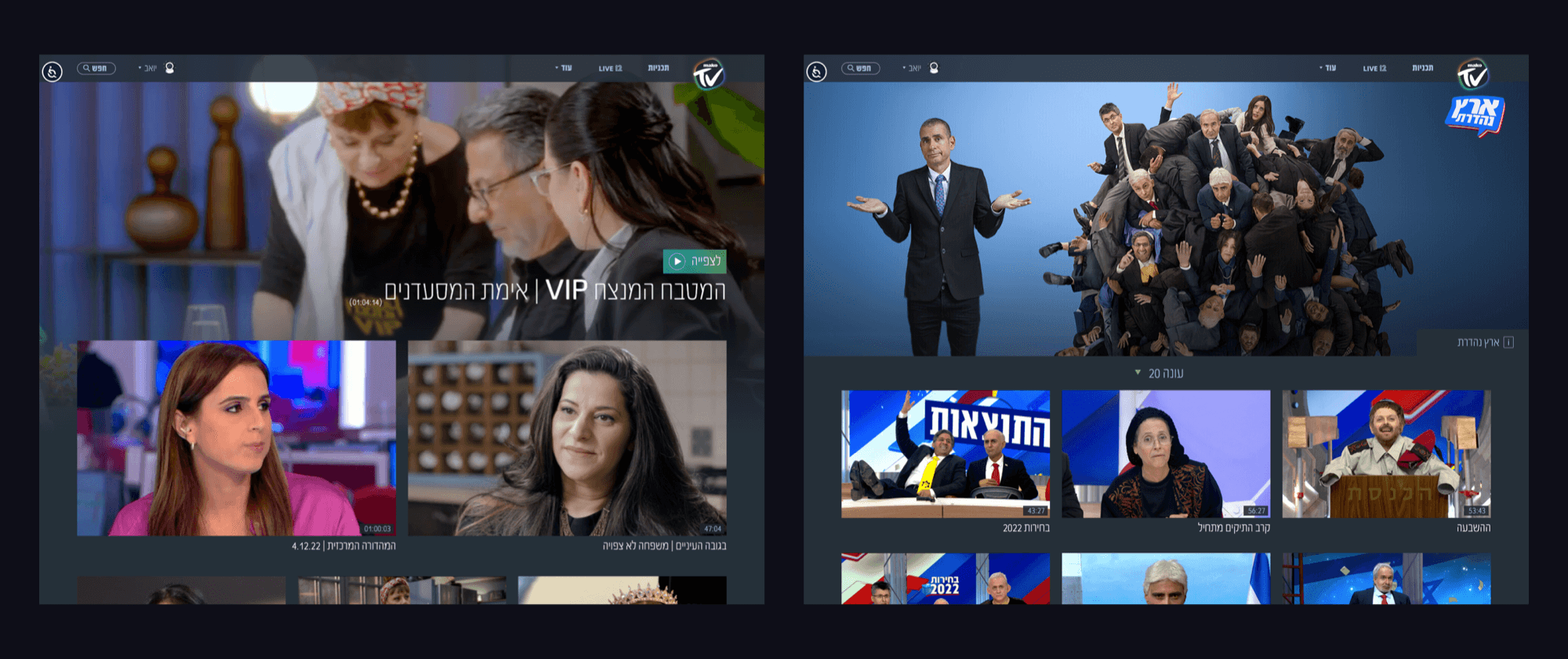
Architecture First, Interface Second
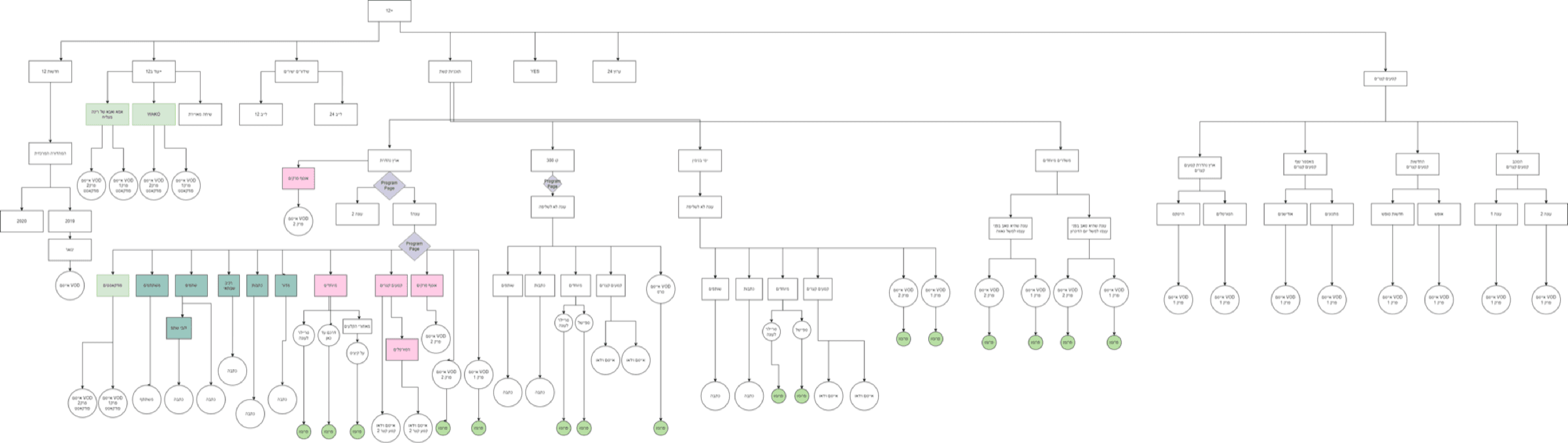
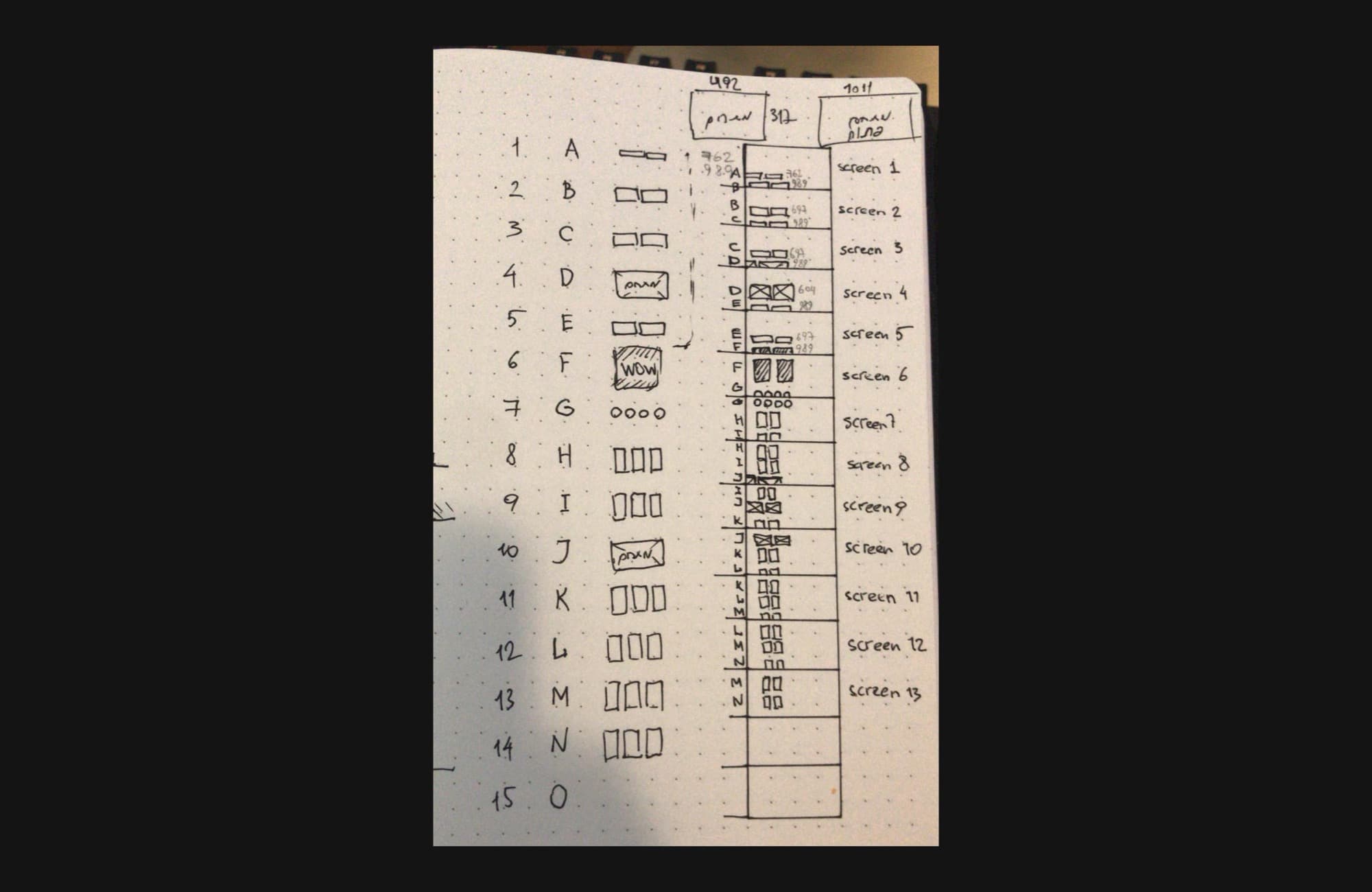
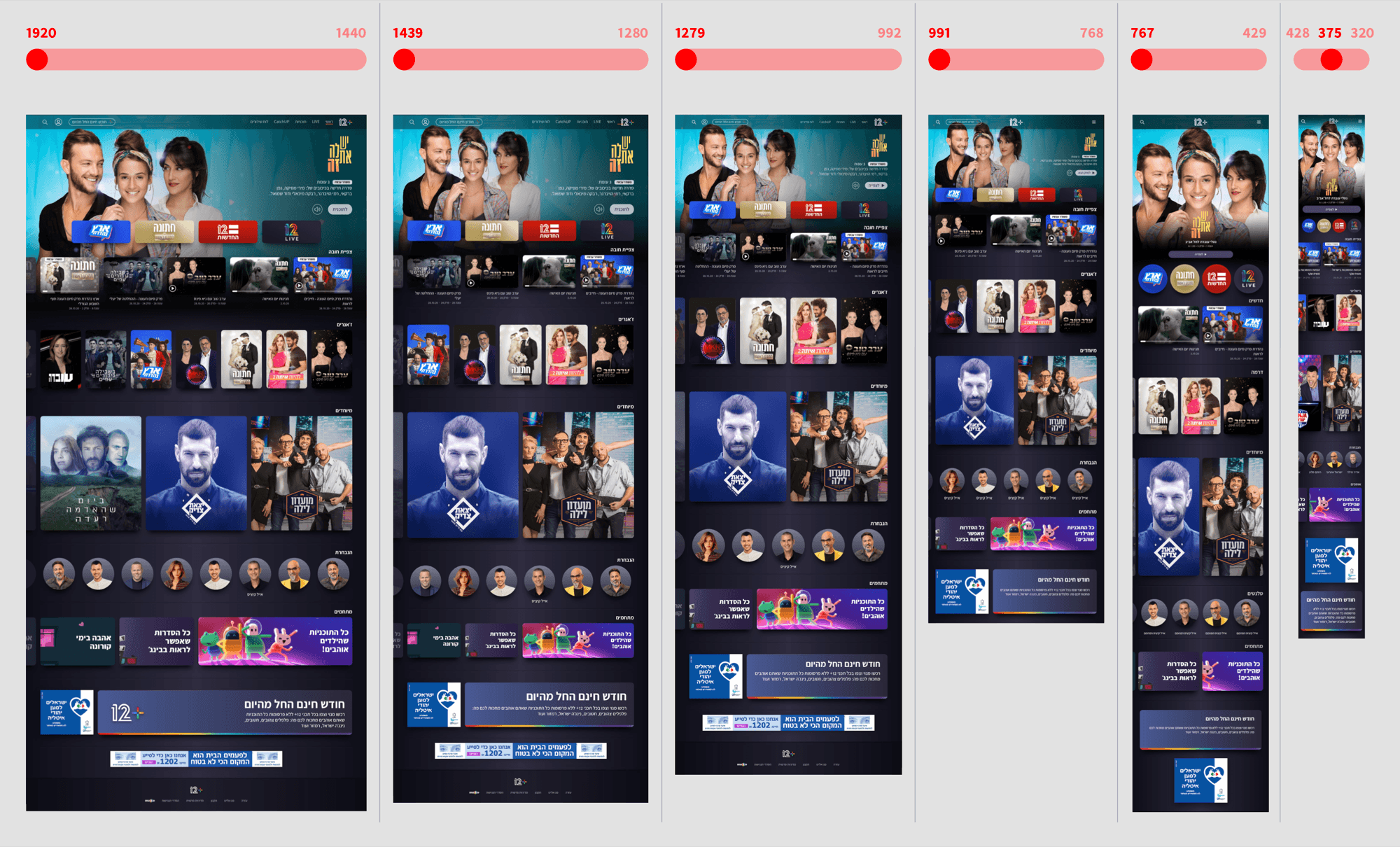
I mapped the architecture before the interface: live, VOD, news, EPG, profile and settings as one tree. Then hand sketches of 13 screen building blocks, a responsive study from 1920 down to 320 pixels, and a component system built in Figma.
“makoTV was a habit. 12+ had to be the destination.”
Holding One Identity Across Every Screen
Senior UX Designer, Cross-Platform Lead at Keshet Media Group, working with two other designers, a PM and dev team.
- 01Reach live Channel 12 instantly, on any screen.
- 02Catch up on missed shows without hunting.
- 03Get breaking news immediately, wherever they are.
4 Behaviors I Designed Around
Live TV Still Wins
Users chose live Channel 12 over VOD, so immediacy and shared moments had to lead every layout.
Catch-up Complements Live
Viewers used makoTV to catch missed shows, confirming that VOD supports live television rather than replacing it.
The Cord Cutting Opportunity
Many 25-40 year olds skip cable and rely on cheaper smart TVs, a clear opening to win new users.
News Can't Wait
In emergencies Israelis expect instant, on the go access to live news, on whichever screen is closest.
I Didn't Start From Zero
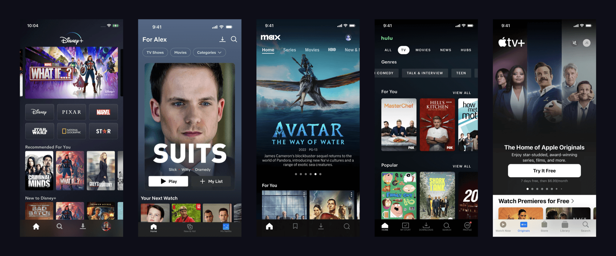
I didn't start from zero. Before drawing a screen I studied how Disney+, Netflix, Hulu, Max and Apple TV+ handle discovery, hierarchy and television navigation, then decided which conventions 12+ should inherit and where a Hebrew, right to left flagship needed its own answer.
Mapping the architecture before the interface. One tree covering live, VOD, news, EPG, profile and settings, so every title stays findable for people browsing and for Google indexing every page.
And the tree as it was actually drawn: around two hundred nodes in Hebrew, the language 12+ ships in.
Sketching the building blocks by hand: a numbered inventory of 13 screens, resolved on paper before anything reached Figma.
One layout, 8 breakpoints. The home page held at 1920, 1440, 1280, 992, 768, 428, 375 and 320 pixels.
1 Identity, Not 8 Apps
The turning point was realising I was not designing 8 products. I was designing one identity that had to survive 8 platforms, countless remote controls and every screen size between a phone in a hand and a television across the room. The question stopped being what each app should look like, and became how 12+ stays itself everywhere.
“How might we give 12+ one confident identity across 8 platforms, countless remotes, and screen sizes, without it feeling like 8 different apps wearing duct tape together?”
1 System, 8 Platforms
Consistency had to be built, not promised. In Keshet12, the broadcaster's own typeface, I defined primary and secondary buttons across four variants and three sizes, plus four configurations of the credit card, built from stroke, tag, time tag, progress bar and tint.
The page is a horizontal gradient, not a flat fill: deep at both edges, lighter through the middle. Cards sit on one surface above it.
One interactive blue, and a red reserved for the live indicator so nothing else can borrow its urgency.
The plus takes its colours from Keshet Media Group and Channel 12, and each quadrant is a linear gradient rather than a flat fill, which is why it reads richer than a four-colour mark.
Read off the shipped product at mako.co.il/mako-vod through computed styles rather than sampled from screenshots. Text runs white, with secondary at 60% and tertiary at 80% opacity, and artwork sits under a 9 9 15 scrim at 0.7 or 0.4.
12+ on the Screens It Ships On
Smart TV, Home: live Channel 12 is the front door
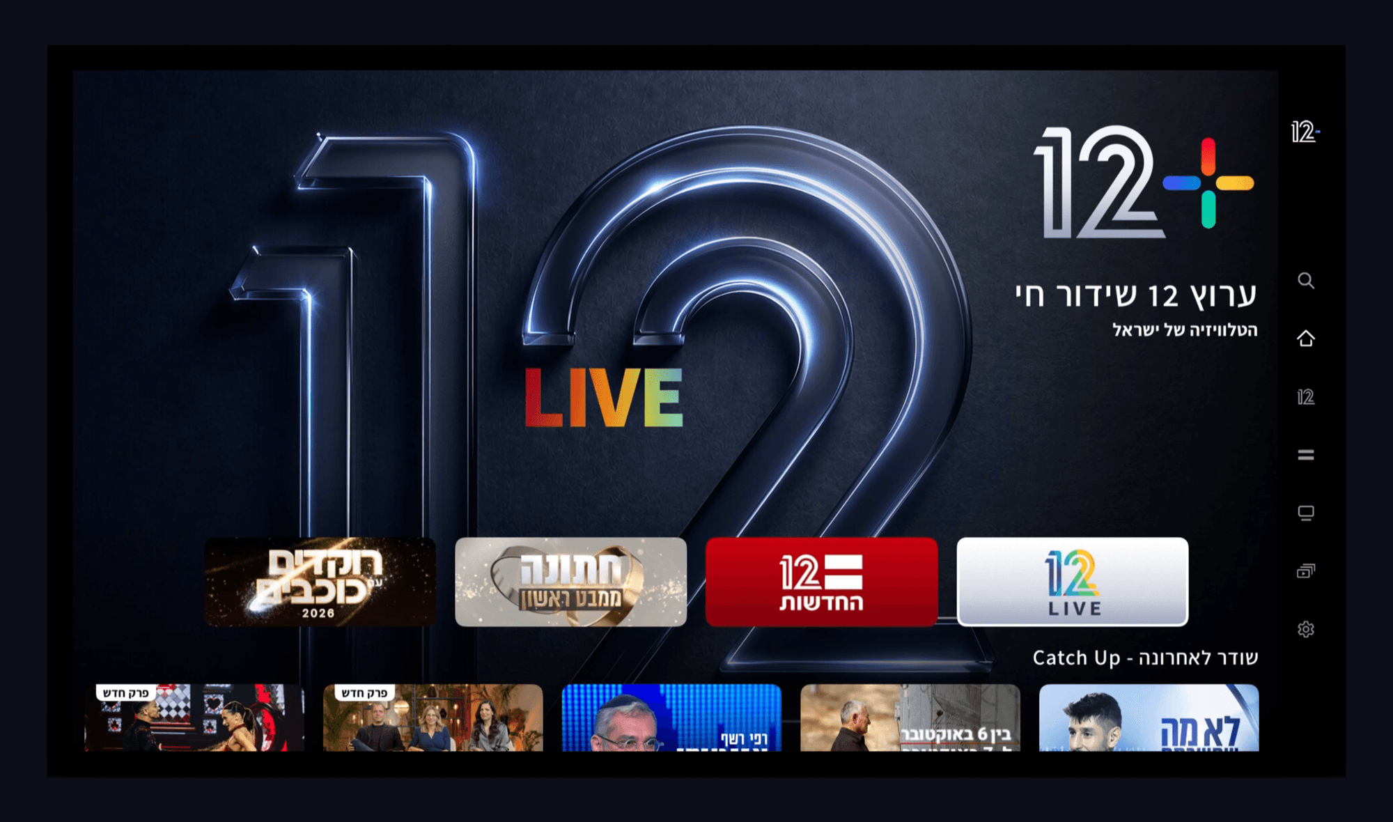
- 1
Live leads the layout
Immediacy won the research, so live Channel 12 takes the whole first screen.
- 2
The rail never moves
Search, home, channels, guide and settings sit in one place on every TV screen.
- 3
Catch Up peeks in
The next row is cut by the bottom edge. On a screen with no scrollbar, that is the cue.
Mobile, Home: the same front door in a hand
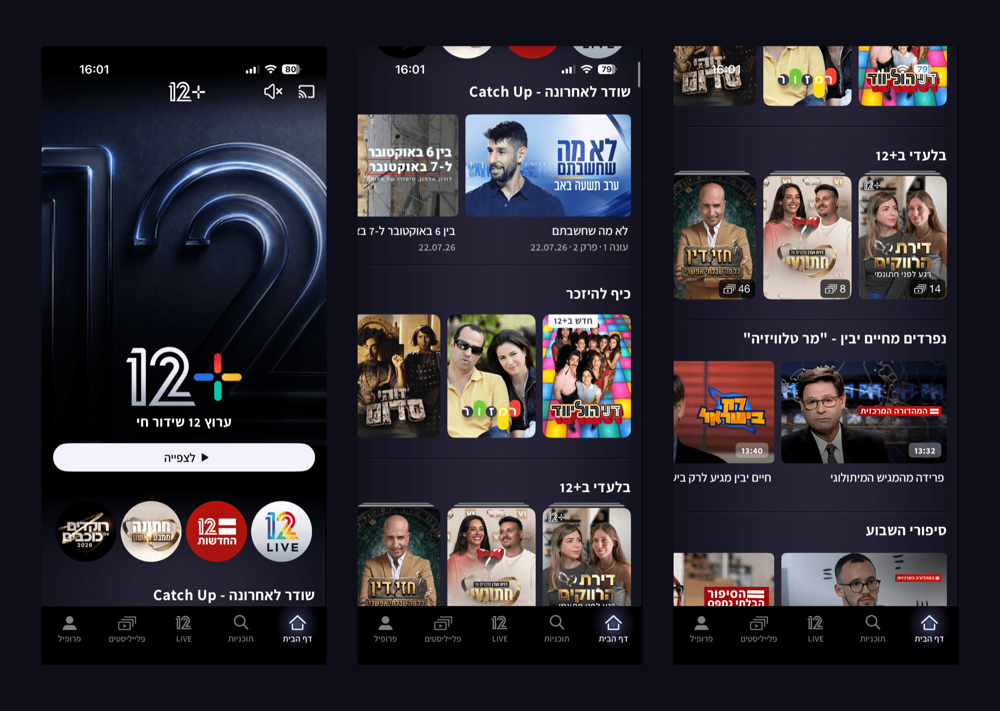
- 1
The same hero, one tenth the width
Live Channel 12 opens the phone the way it opens the television, one button under it.
- 2
The same card system
Artwork, title, season and episode meta, a time tag. Only the count per row changes.
Smart TV, All Programmes: the focus state does the pointing
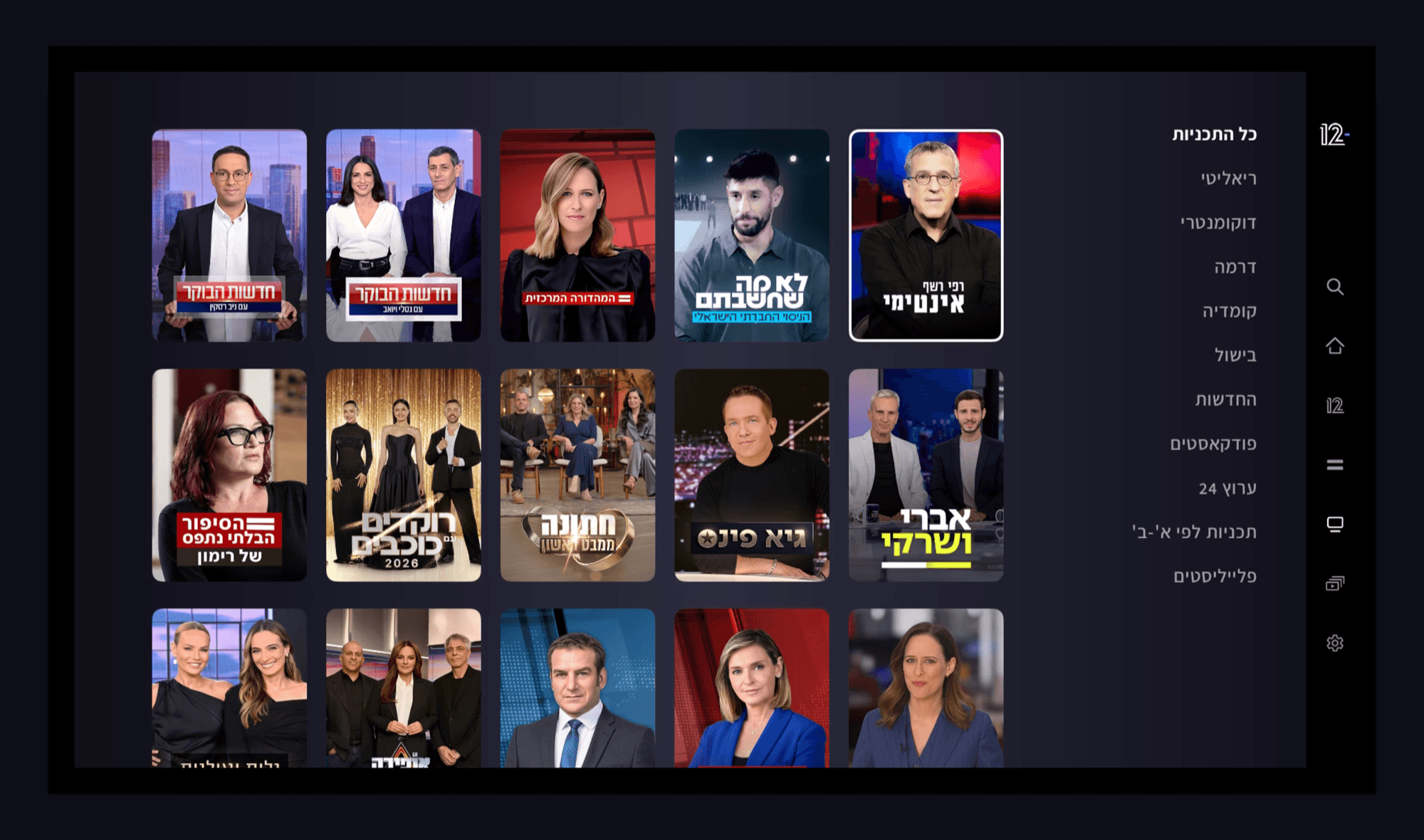
- 1
Focus, readable at ten feet
A white ring and a small scale-up. There is no cursor to point with on a television.
- 2
Genres beside the grid
The genre list sits next to the grid, so filtering never costs a screen change.
Smart TV, Show Page: seasons, tabs and one way back in
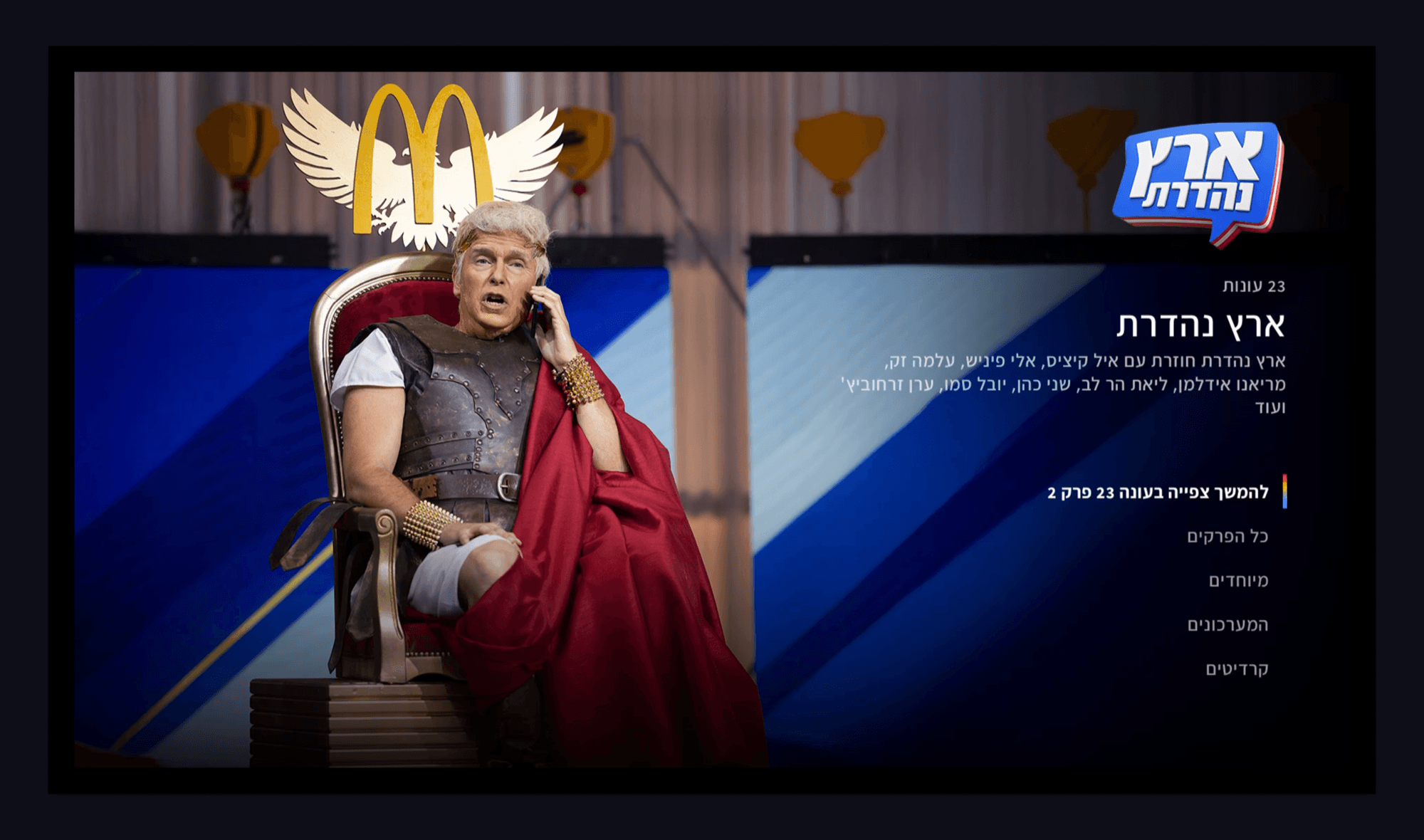
- 1
Key art carries the page
The show gets the whole frame. The season count is the only scale the page needs.
- 2
One obvious way back in
Continue watching is the only highlighted action. The four tabs sit under it.
Mobile, Browse and Show Page: search first, then depth
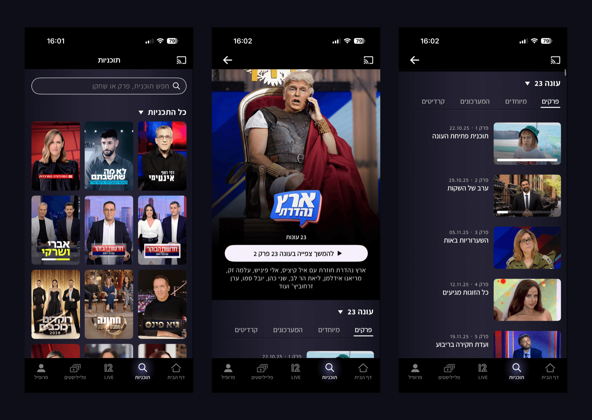
- 1
Search above the grid
Browsing a full library is slow on a phone, so search sits above the grid.
- 2
The same four tabs
Episodes, specials, sketches and credits, in the same order as the television.
Smart TV, Live Player: time-shifting inside a live broadcast
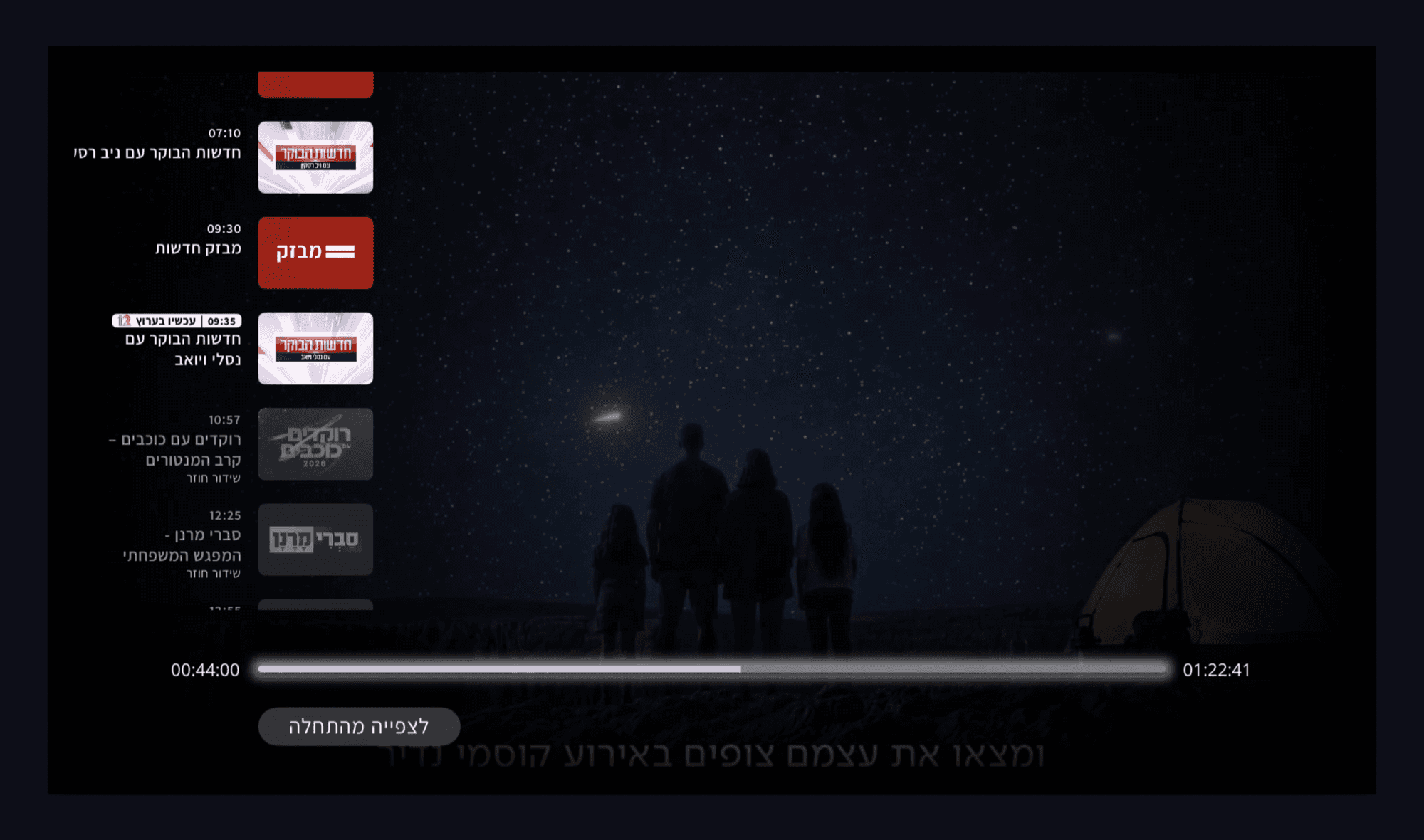
- 1
The schedule is a rail, not a screen
Now is marked in place, earlier above and later below. The remote walks the day.
- 2
A position inside a live broadcast
44 minutes into a programme that runs 1 hour 22, and still live on air.
- 3
Back to the beginning
One control for what people want when they arrive mid-programme, next to the scrub.
This is the hardest interaction in the product. A live channel has no fixed start, so the player has to hold a position inside a broadcast that is still going out, show what is on now and what is next, and offer a way back to the beginning without ever losing the live edge.
Mobile, Live Player: the same schedule, opened by a thumb
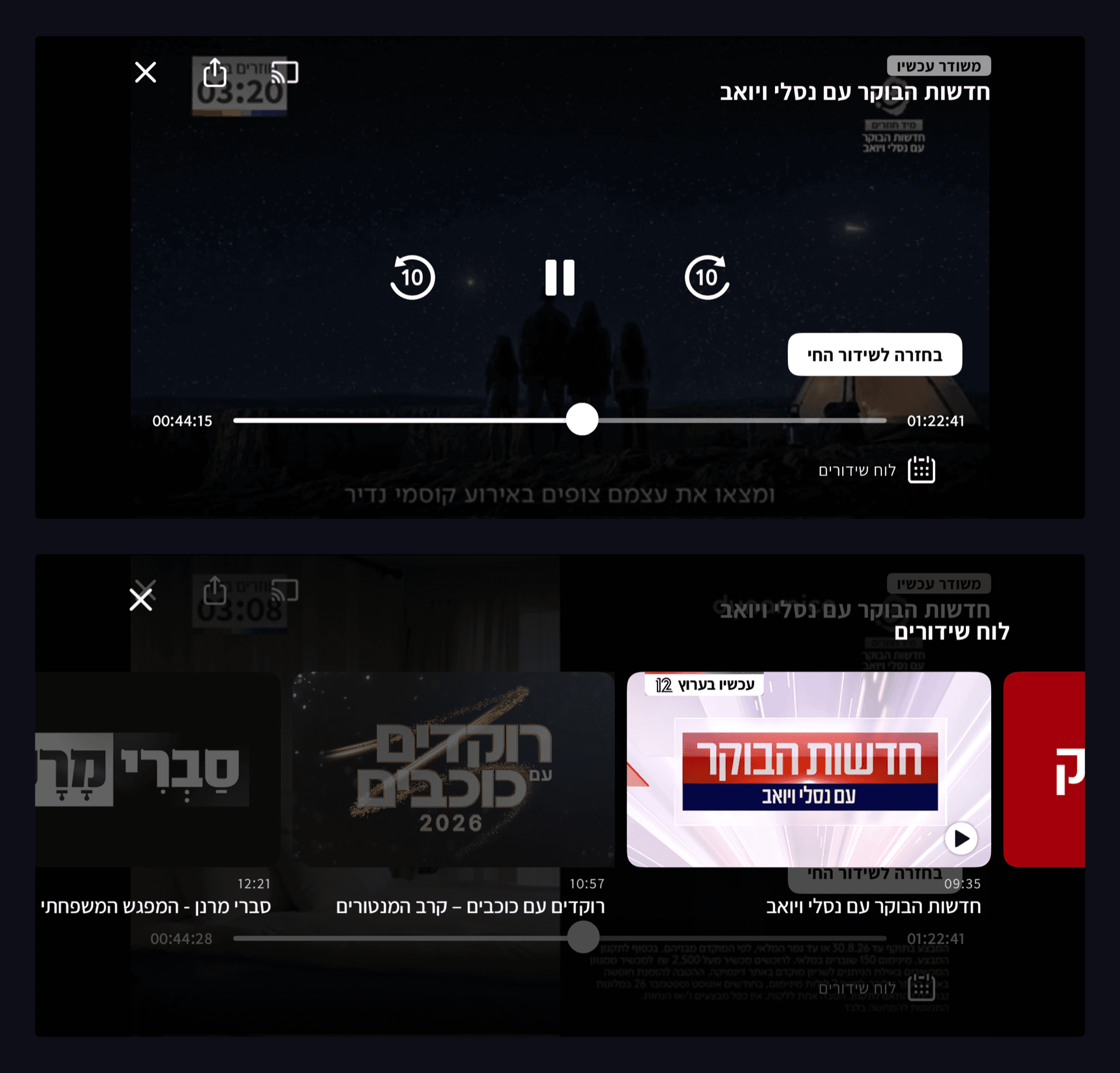
- 1
The live edge is never hidden
The same 44 minute position, with back to live beside it rather than in a menu.
- 2
The schedule becomes a button
No room for a persistent rail, so the schedule is asked for by name.
- 3
A carousel instead of a rail
The same programmes and the same marker, swiped. The video keeps playing under it.
Same model, different mechanics. On television the schedule is a rail that is always on screen and walked with a remote. On a phone there is no room for a rail, so it becomes an overlay opened by an explicit TV schedule button and swiped with a thumb. Both keep the scrub position and both keep a way back to live.
Smart TV, VOD Player: scrubbing with a preview, not a guess
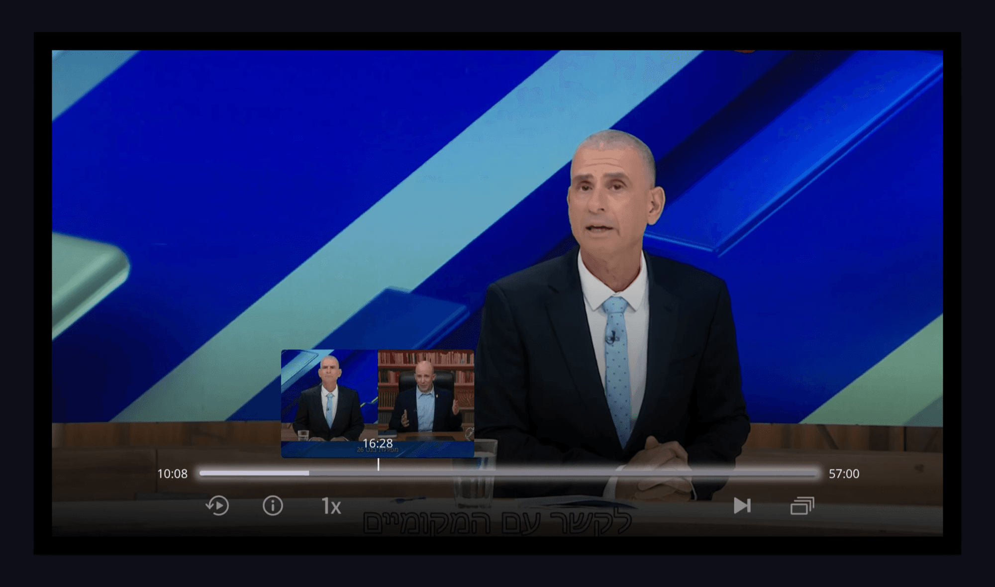
- 1
A frame, not a timecode
The thumbnail shows the moment you are about to land on. Remote seeking is coarse.
- 2
Everything else in one row
Restart, information, speed, next episode and the episode list, on demand only.
Mobile, VOD Player: full-screen controls in landscape
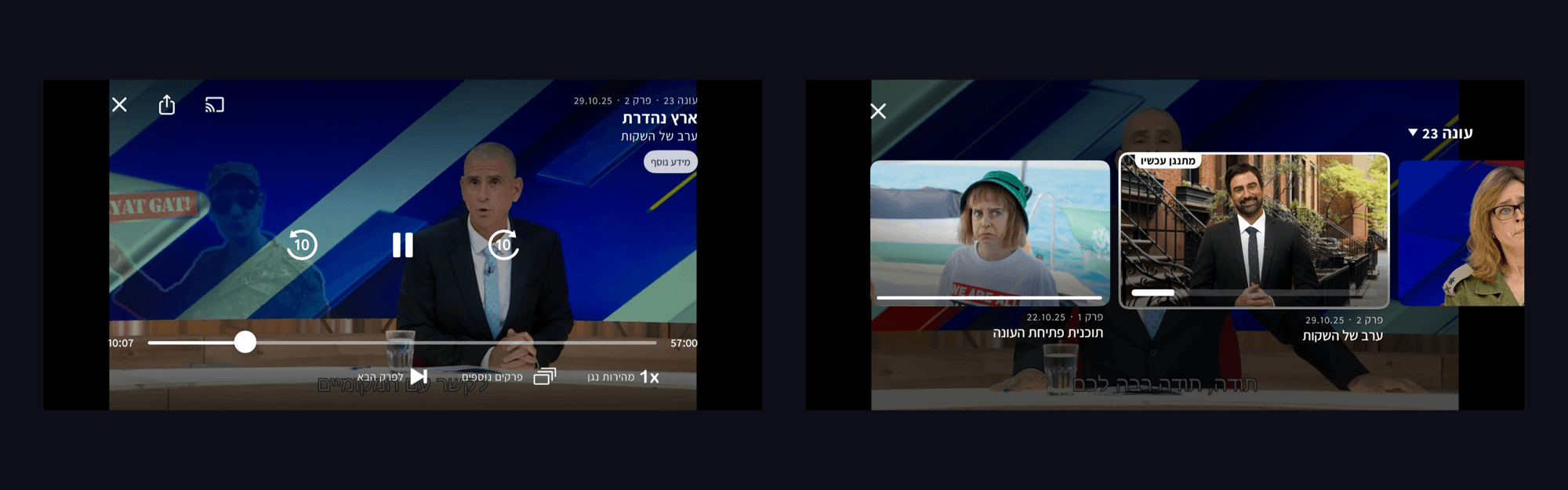
- 1
Thumb-sized, not remote-sized
Ten second skip, speed, next episode and the list, spaced for two thumbs.
- 2
Now playing, marked
The carousel opens over the video with the current episode outlined.
Smart TV, Playlist: a collection built around one subject
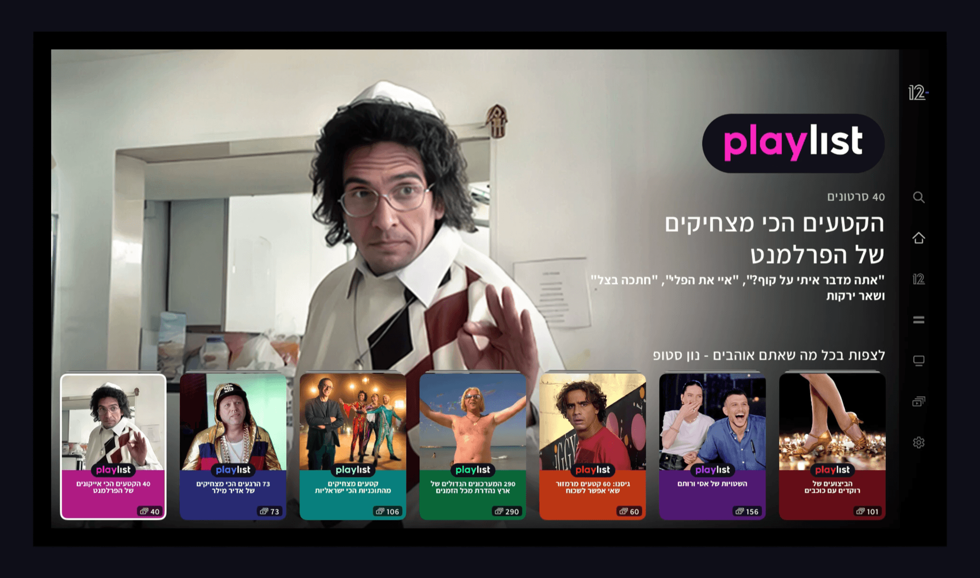
- 1
A subject, not a clip
Each playlist gathers dozens of clips around one subject, with its count on the card.
- 2
Colour instead of key art
A playlist has no single frame to stand for it, so each one gets a flat colour.
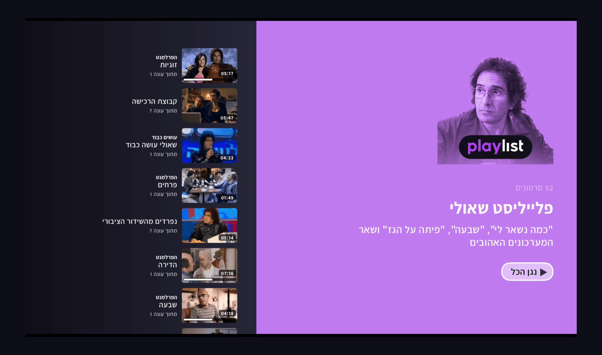
- 1
Every clip carries its source
Title, the season it came from, its length, and a progress bar if it was part-watched.
- 2
Play all, or pick one
One button plays the collection in order. The list is there for anyone who wants a single clip.
Mobile, Playlist: the same collection in a thumb
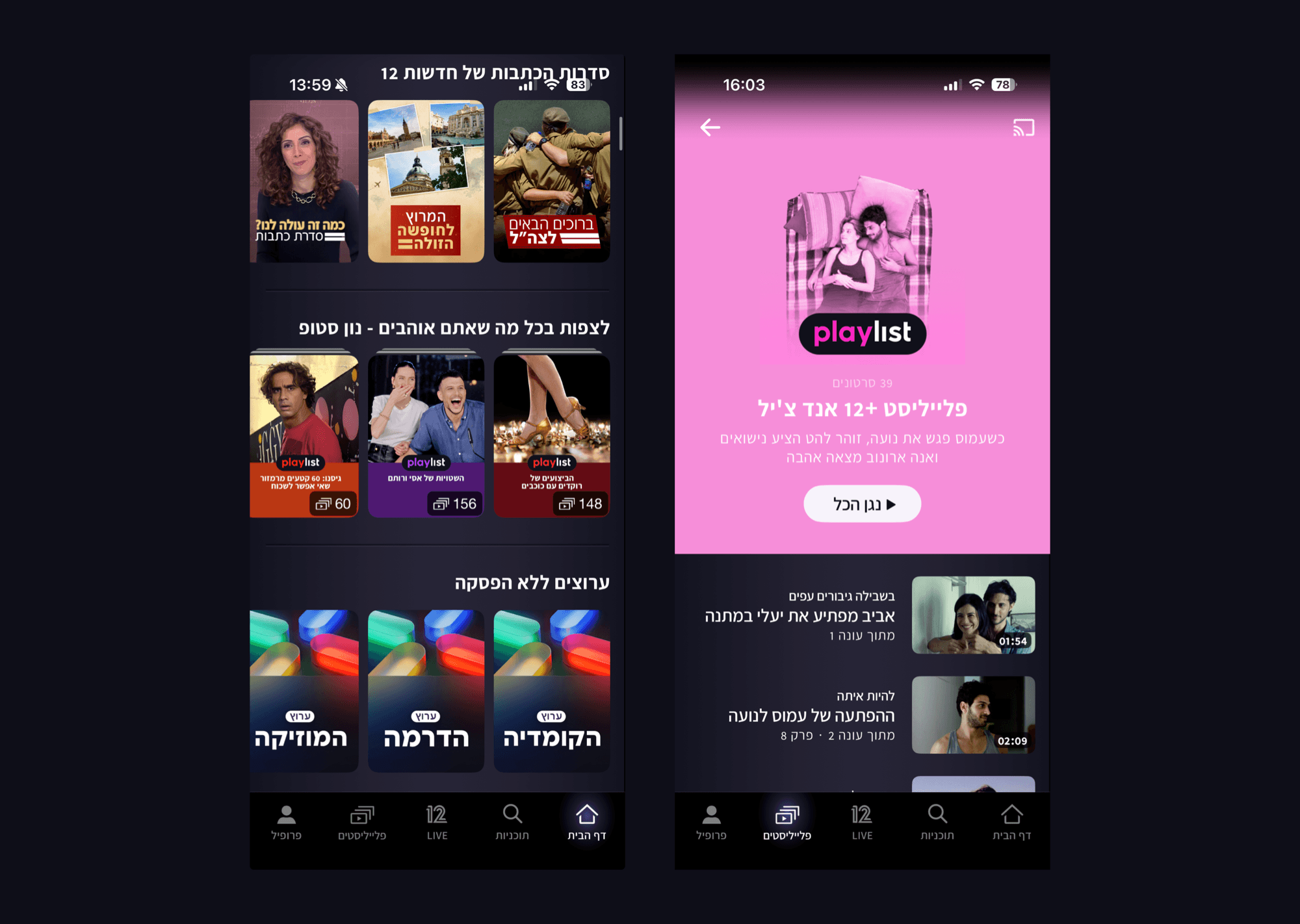
- 1
The count is the promise
Every card states how many clips are inside, so the size of the collection reads first.
- 2
The same page in a thumb
The same tinted cover, count and play all as the television, stacked rather than side by side.
One Card, Three Inputs
12+ has more than one card shape. This one we called the credit card, and every configuration of it is drawn twice. On web the selected state is a hover, on Smart TV it is remote focus read across a room, on mobile it does not exist.
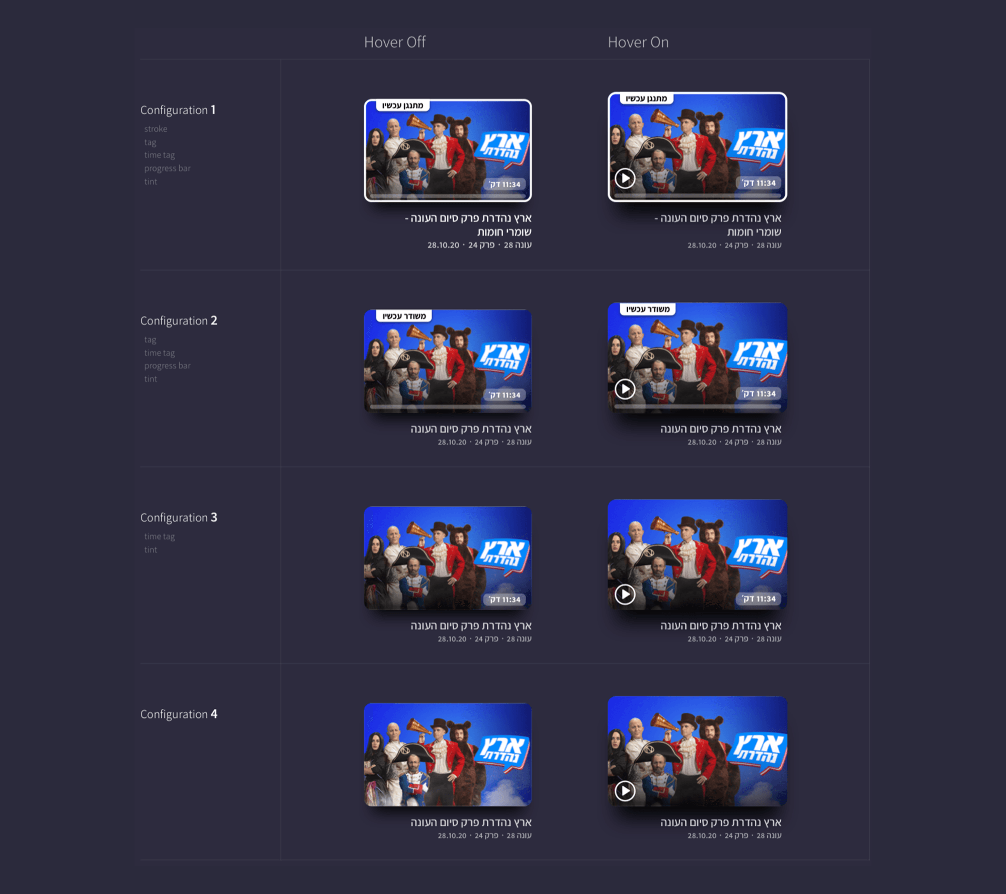
Each configuration sets what the card carries: a tag, a time tag, a progress bar when the video was left part-watched, a tint and a stroke. Hover on adds the play button to every one.
3 Rounds That Fed Each Other
3 rounds, not 3 parallel tests. 12 platform-native participants each, and every fix from a round shipped to all platforms before the next round ran.
Round 1 tested Smart TVs with 12 people who mainly watch on Smart TVs. Round 2 tested responsive web with 12 desktop and mobile web viewers. Round 3 tested the mobile app with 12 app viewers.
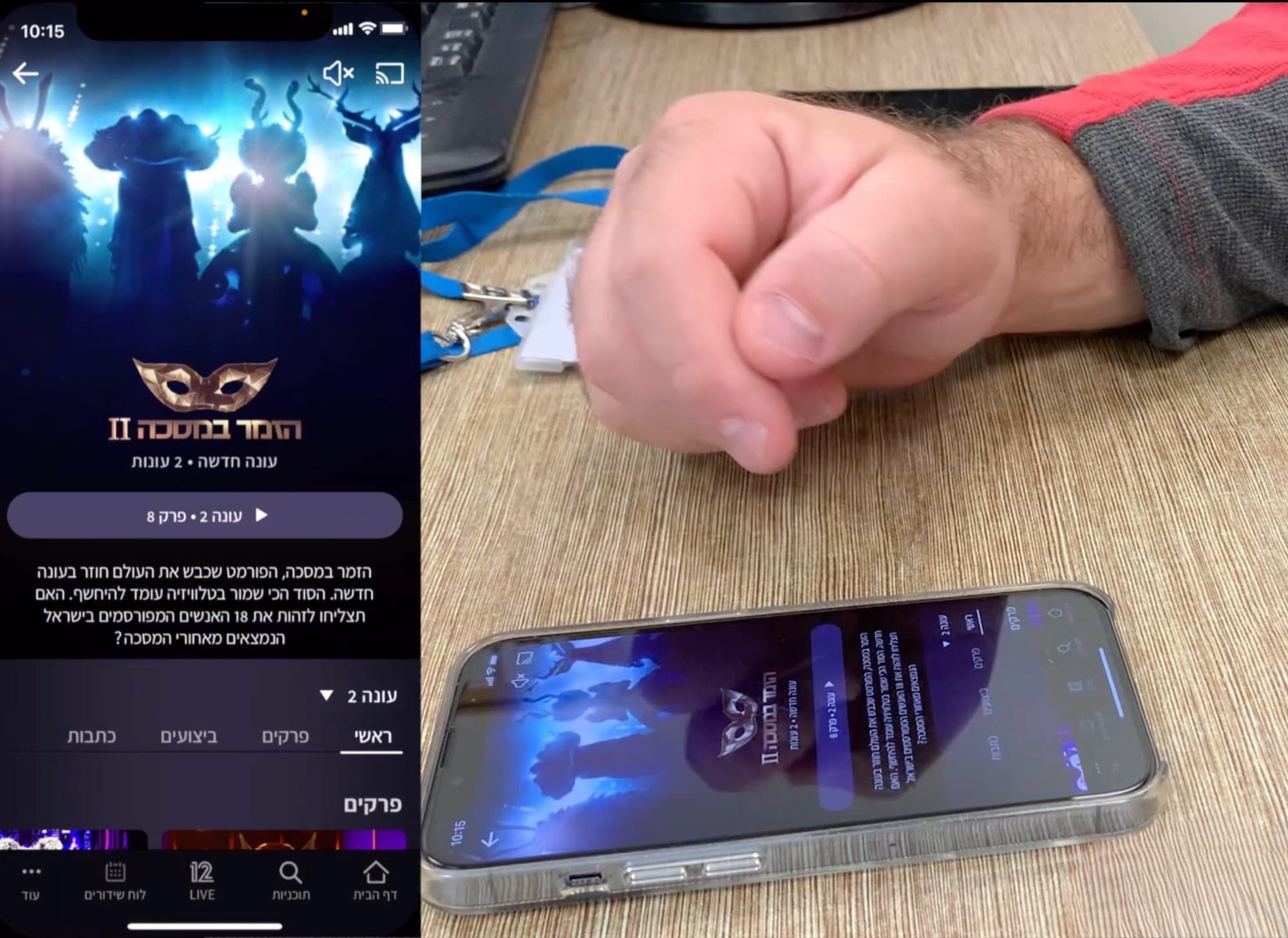
Round 3: the mobile app, with viewers who watch mainly on their phone. Their screen was mirrored beside them, so I could follow what they were doing while they talked through it.
High Satisfaction
Across web, mobile, tablet and TV, usability sessions reported consistently high satisfaction with the interface.
100% Task Success
Every participant completed their assigned tasks without failure, on every platform included in the sessions.
Cross Platform Learning
Each round's fixes shipped to every platform before the next test, so improvements compounded.
Ad Friction
One complaint recurred, advertising interrupting the experience, the cost of keeping every title free to watch.
What Changed for Keshet 12
12+ did not only replace makoTV, it changed how much people watch. Average daily watch time moved from 52 minutes to 93. Daily users grew from 150K to 200K. Monthly viewing hours reached 1.2 million, a 195% rise, delivered by one design system across more than 8 platforms.
If I Have More Time...
The product answered ad friction commercially, with a paid tier that removes ads without locking a single title. That is a fair answer, and it is not my answer. Most viewers stay on the free tier, so the work I would keep doing is break placement, frequency and countdown clarity, so free viewers pay less attention than they do now.
Want to hear the longer version?
Curious how one design system holds together
across 8 platforms and countless remotes?