Articu: A CMS Built toPublish Breaking News Faster
A content management system designed to get breaking stories published in seconds, not minutes, without the usual clutter.
As the sole product designer, I led Articu end to end: from interviews with five newsroom editors through research synthesis, information architecture, interaction design, and a full design system. Articu is a CMS built for the pressure of breaking news, where publishing first wins. I mapped editor workflows, cut the cluttered article form to its essentials, added real-time performance data, and designed two publishing paths so speed never costs control.
Finding Where the Newsroom Loses Time
Speed Is the Product, but the Tools Fight It
News editors are judged on being first. Every second lost to a cluttered form, a clumsy image upload, or a folder tree goes to a competitor. The old CMS buried daily actions under fields nobody touched.
Five Editors Told the Same Story
I interviewed five editors across different desks, then synthesized with affinity mapping, empathy mapping, and a journey map to find where the workflow broke. Competitive research on adjacent CMS tools showed which patterns editors already trusted, so I could borrow instead of reinvent.
“There is a reason why a competing outlet is sending push notifications faster than us.”
Who Articu Serves
Articu is built for one role under constant deadline pressure: the newsroom editor who has to publish first.
- 01Publish breaking news before any competing outlet does
- 02Move through repetitive publishing tasks without friction
- 03See real-time performance to decide what to push
Grouping notes from five editors surfaced the recurring habits, frustrations, and needs shared across different newsroom desks.
Habits
Pain points
Strong quotes
Inner feelings
Past experience
4 Pain Points That Slowed Every Story
The Form Fights the Writer
Too many fields, and a text editor that feels like code, push editors to draft in Word and paste back in.
Images Take Too Long
Adding images means juggling versions and flipping to preview to fix order, again and again.
No Real-Time Data
Editors can't see live performance, so they guess at what to publish and promote next.
Lost in the Folders
Unintuitive, cluttered folders waste time and cause errors, made worse by staff turnover.
Mapping the editor's path from source to published story showed where the workflow leaks time.
- 1
Getting the story
RushedAlertTasks- Grab the report from a source
- Draft it in Word first
OpportunityLet editors draft inside Articu so nothing is copy-pasted
- 2
Finding the folder
ImpatientDistractedTasks- Open the right site
- Dig for the topic folder
OpportunitySurface recent folders and shortcuts on the dashboard
- 3
Filling the form
FrustratedOverwhelmedTasks- Enter every required field
- Fix image order in preview
OpportunityCut the form to essentials, place images by drag and drop
- 4
Preview and publish
CautiousHopefulTasks- Check the preview
- Get editor approval
- Publish
OpportunityEdit in a live article view so the preview is the form
- 5
Push and follow-up
RelievedWatchfulTasks- Send a push notification
- Ask social to post
- Track comments
OpportunityTrigger push and social from the published item
What I Took From the Tools Editors Already Know
I compared Articu against two camps: heavyweight traditional CMS platforms and the newer no-code builders. The goal was not to out-feature them. It was to keep the few things editors trusted and drop the friction that came with everything else.
- Traditional CMS
- Flexible but slow to set up
- No-code builders
- Simple but a shallow CMS
- Traditional CMS
- Edits in a real preview mode
- No-code builders
- Mostly static or limited editing
- Traditional CMS
- Endless plugins, dated interface
- No-code builders
- Locked to the builder
- Traditional CMS
- Depends on plugins
- No-code builders
- Basic or absent
- Traditional CMS
- Not native
- No-code builders
- Not native
- Traditional CMS
- Varies by theme
- No-code builders
- Mobile-friendly but basic
Based on my competitive review of WordPress, Wix, Webflow, and Framer, early 2025. Both camps describe general category patterns rather than individually audited products.
Editors kept naming WordPress, and one thing in particular: editing in preview mode. So Articu makes the editor itself look like the published article, instead of a code-like form the writer has to imagine their way through.
The path from a new item to a live story, with two branches: the Quick Item lane before a story is complete, and an optional push after publishing.
The Fix Was Fewer Steps, Not More Features
Editors were escaping the tool, drafting in Word and fixing images in preview. The form felt like code and the preview lived somewhere else, so I collapsed both into one live editor and added a fast lane for breaking stories.
One System Behind Every Screen
Speed needs consistency, so I built the interface on a single token set and a reusable Figma component library: one color system, one type scale, an 8px grid.
Blue 400 is the brand anchor; Blue 500 fills every primary button and active state.
Editorial state draws from these three ramps, so status reads at a glance across a busy desk.
Nine steps of gray carry every surface, border, and line of body text in the product.
Articu's real product tokens, authored as Figma variables: five ramps of nine steps plus black and white, 47 tokens. Single theme, no dark-mode variant exists for these.
The System, Screen by Screen
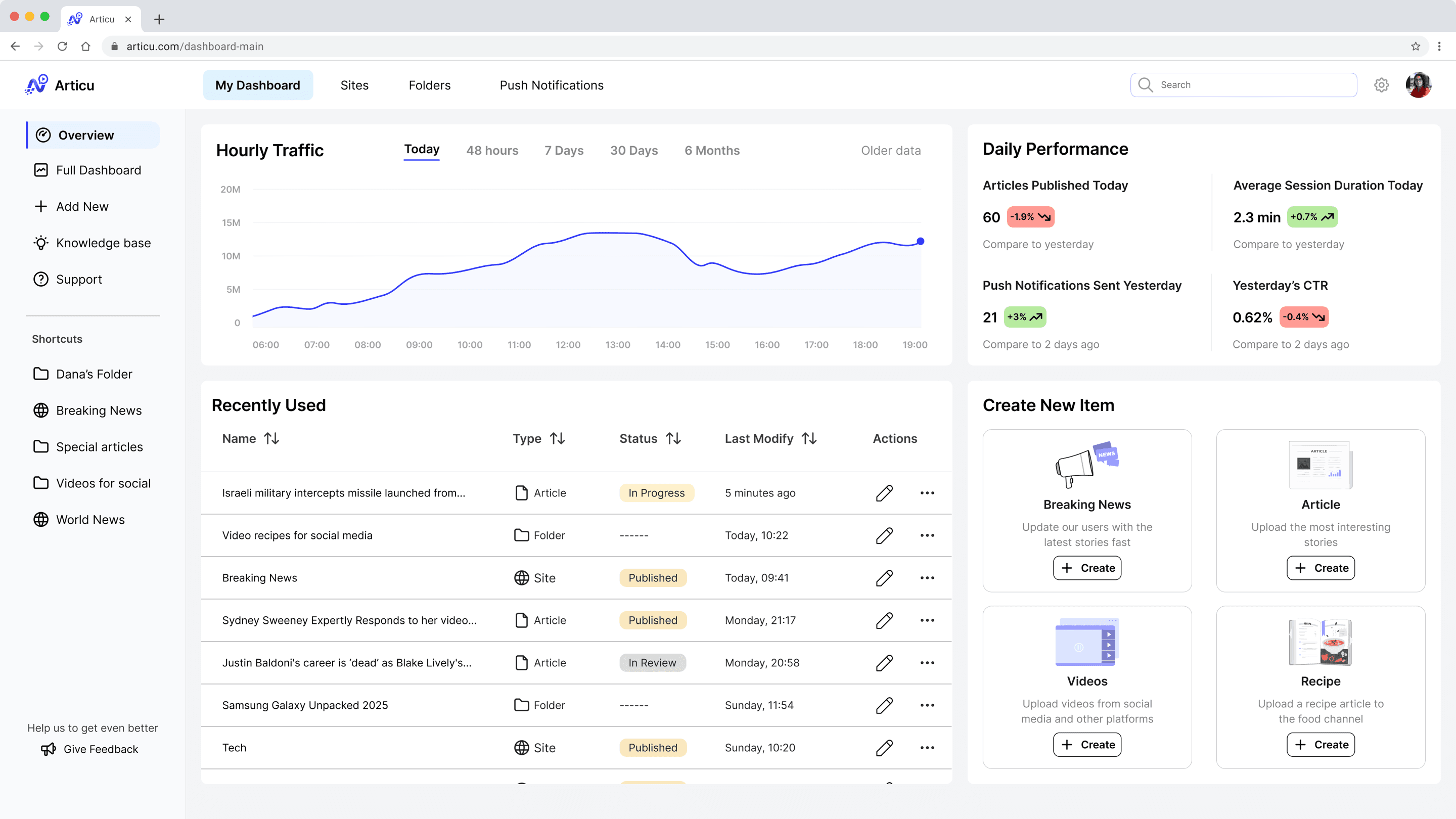
The Dashboard Editors Open To
- 1
Real-time traffic
The live hourly chart answers the top complaint: editors could never see performance as it happened.
- 2
Back to work in one click
Recently Used and pinned shortcuts remove the daily hunt through cluttered folders.
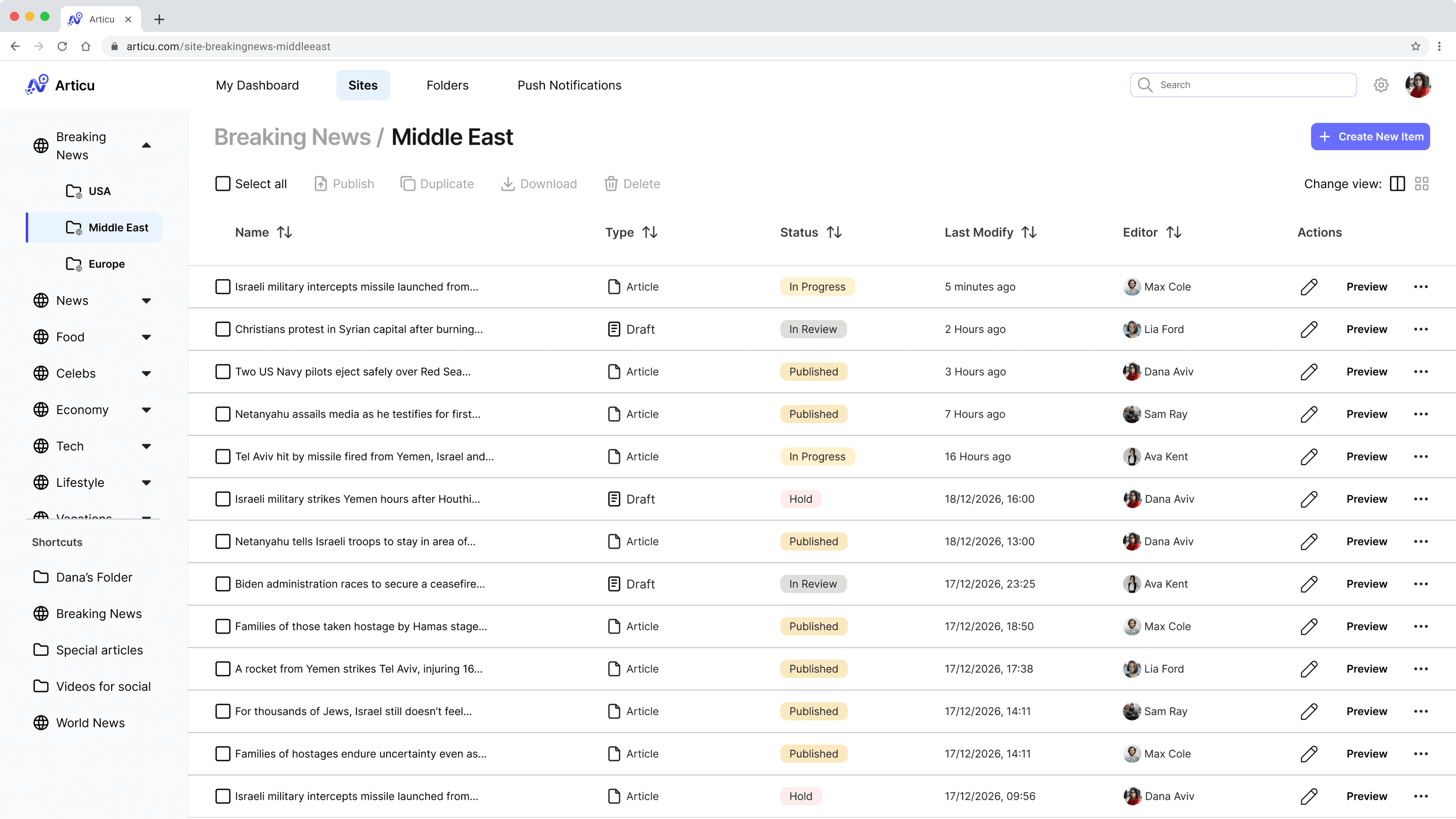
The Site Page, Where Stories Are Managed
- 1
Batch actions on top
Select all, then publish, duplicate, download, or delete, so routine work happens in bulk instead of one row at a time.
- 2
Status at a glance
Published, In Progress, In Review, and Hold badges make editorial state scannable across a busy desk.
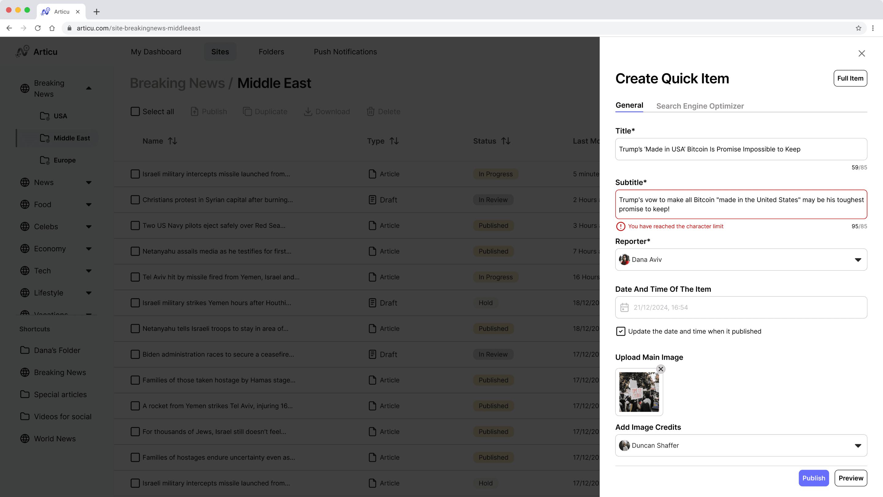
Quick Item, the Breaking-News Lane
- 1
Essentials only
The Quick Item panel captures just what a breaking story needs, so editors publish first and fill in the detail later. One tap switches to the Full Item form.
- 2
Guardrails, not clutter
Inline character limits keep fields valid without the bloat that made the old form feel like code.
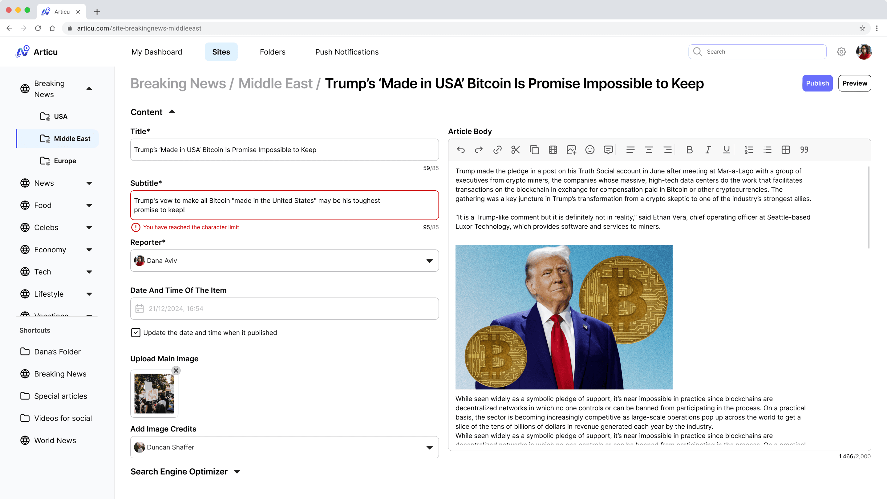
The Full Item, Where the Story Gets Finished
- 1
The preview is the form
The article body is edited as a formatted article, images in place, not as a code-like field the writer has to imagine their way through.
- 2
The depth Quick Item defers
Image credits and the Search Engine Optimizer block sit at the bottom, filled in once the story is no longer a race.
This is the same breaking story the Quick Item started. Nothing is re-entered: the editor reopens the item and the Full Item view adds the rich article body and the SEO block around what is already there.
A Clear Finish Line
- 1
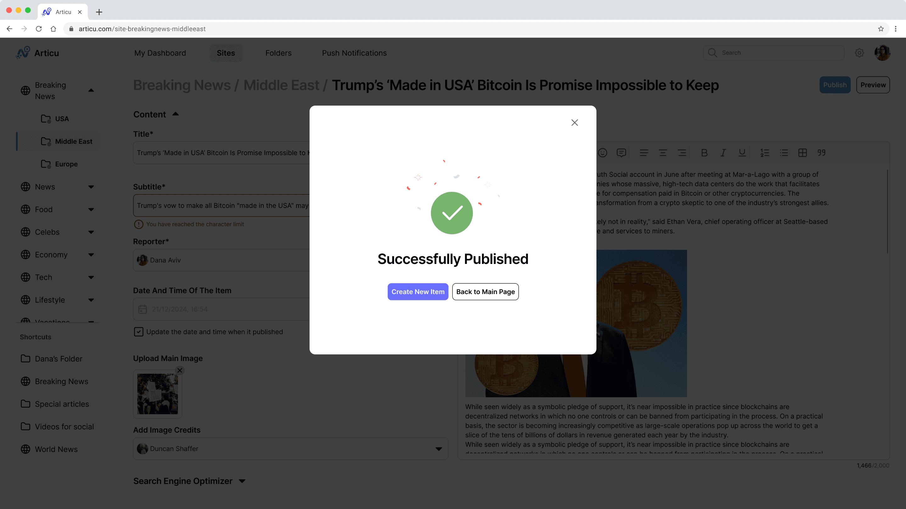
Publish, confirmed
The dialog closes the loop on the one action editors are judged on, with no ambiguity about whether the story is live.
- 2
Straight into the next one
The two obvious next steps are offered on the spot: start another item, or go back to the dashboard.
Push Notifications, Sent From the Item Itself
- 1
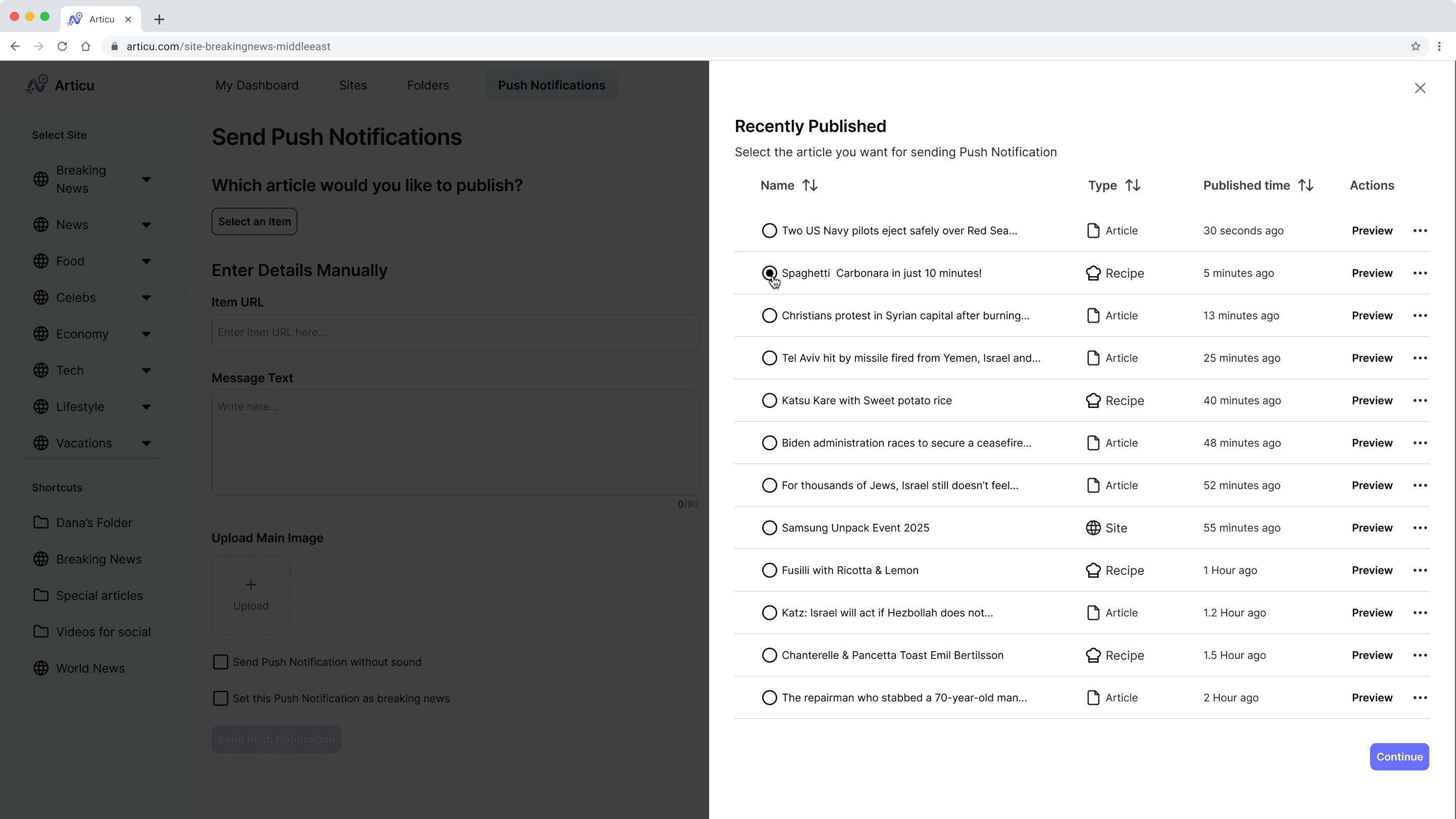
Pick what just published
Editors choose a live item instead of re-entering its details, so the alert goes out in seconds.
- 2
Or write it by hand
A manual path with a URL, a length-capped message, and an image covers everything the list doesn't.
- 1
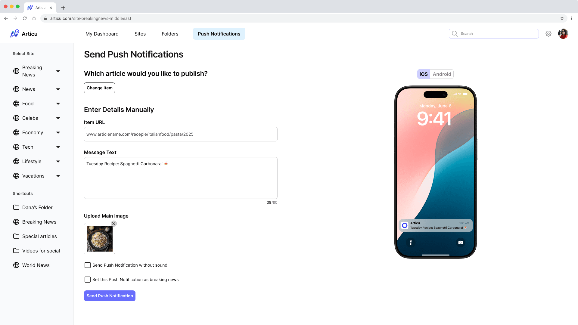
Content fills itself
Choosing the item writes the URL, the message, and the image for the editor, and every field stays editable.
- 2
See it before it ships
A live iOS and Android preview shows the alert exactly as a reader will get it, so nobody sends a truncated headline.
Two Speeds of Publishing
Not every story arrives finished. Articu offers two paths from the same button: a Quick Item panel that captures only the essentials for breaking news, and a Full Item form for complete articles.
How I Will Know It Works
Articu is designed but not yet built, so the next step is validation. These are the measures I defined to test whether the design delivers.
Time on the Article Form
Compare minutes per item against the old CMS, targeting a 10% drop per published item.
Items Published Per Day
Count articles and reports per editor per day, targeting a 12% rise over the current baseline.
Calls to CMS Support
Track support tickets across the first two months, targeting 15% fewer than today.
Task Success and Errors
Run task-based usability tests with editors, measuring time on task and error rate.
What Articu Is Built to Achieve
Because publishing first drives page views, and page views drive ad revenue, faster editors are a business result, not just a nicer tool. Articu is designed so a single editor can take a breaking story from source to live and promoted, without leaving the system or asking for help.
If I Have More Time...
I would get Articu in front of editors and test it against the numbers above, then let real use correct my assumptions. I would design the mobile experience properly, since editors often file from the field, and build out the collaboration and communication features that kept coming up but sat outside this first release.
Want to hear the longer version?
I'm happy to walk you through the research, the trade-offs,
and what I'd do next.